
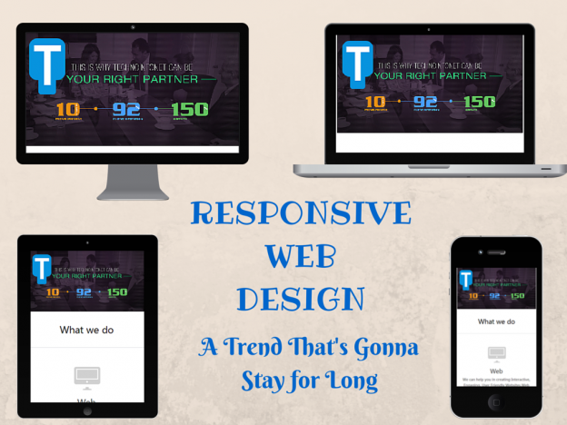
Responsive Web Design – A trend that is going to last longer

Technological advancement was the reason due to which surfing internet or internet usage had gained a lot of importance. This wasn’t the only use which we humans made an optimal use of, we started totally relying on it. Even corporates served the best needs out of it in terms of globalizing themselves and reaching to their target oriented masses. Client/Customer retention being the major focus of corporates, Socializing became utmost important. And now as technology is advancing and becoming nano day by day, its has become a necessity to customize our websites accordingly. According to Statista – The Statistics Portal, in 2013, 73.4% of the overall population was on mobile internet while by 2017 this static is expected to raise up to 90%. As the popularity of portable devices increased, we started accessing our favorite content while being at home or not. But we always had a complain that the websites aren’t user-friendly as well as favorable to their sight. This is the point where a need emerged for a design which could be favorable to all devices starting from PC to mobile phones and tablet. And this kind of design is named as RESPONSIVE WEB DESIGN. This word was first introduced by “Ethan Marcotte” in one of his article and also in his book named “A BOOK APART, RESPONSIVE WEB DESIGN”. Now the question that arises is; What is RESPONSIVE WEB DESIGN, How does it work and whether it is useful or not to adopt…?
WHAT IS RESPONSIVE WEB DESIGN? RESPONSIVE WEB DESIGN in a simple context means a WEB DESIGN that responds to every environment starting from desktop to tablet and mobile. It has adaptable layouts and scalable images that can fit in any screen (irrespective of their size) with out disturbing their clarity. Methods used to achieve RESPONSIVE WEB DESIGN: Responsive web design can be achieved with the combination of FLUID GRIDS and CSS3 media queries and by using flexible images, media player etc.
- FLUID GRID
– People who might be knowing about HTML, might also be knowing about fixed layout as well which is defined in terms of pixels. But if you define any layout static will it vary in dimensions if the screen size is changed…? Obviously, the answer is NO. So to make this dimensions different, rather than defining them in pixels, we define them in percentages. This type of layout is called FLUID GRID.
- CSS3 MEDIAQUERIES
– FLUID GRID is defined in the CSS by the designers in this media queries as they are supported by a large range of Web Browsers. So when ever you open up a responsive web design, this media queries checks the screen size and accordingly adjusts the CSS and display the content.
- FLEXIBLE MEDIA
– When we are talking about responsive web design, it clearly mentions that the media like images, media player etc. used in our content or website also has to be flexible. So while defining the media query for a particular screen size, the sizes for the media are also defined so that whenever you open a website in a specific screen size, media is also displayed accordingly.
After knowing about what responsive web design is and how it is achieved, let’s find out what are the benefits and drawbacks of this development.
BENEFITS OF USING RESPONSIVE WEB DESIGN:
- Corporates can easily reach to their target markets.
- While initially, we were using multiple URLs for different websites, now we can shrink to one URL for one website, So modifications will also be least. So this eventually helps in reducing Time and Money.
- Now as we are moving from a still desktop to a portable tablet or mobile, there are chances of a greater Return On Investment as our reach to targeted audience will increase.
- This advancement is SEO friendly too. SEO means search engine optimization. After listening the word SEARCH ENGINE the first thing that comes to our mind is GOOGLE, the most visited and loved search engine. But do you know Google loves responsive web designs. Its easy for him to index website once rather than to two different websites with same content but different web designs. Also it removes duplicate content and we have invest less in SEO.
- Also it optimizes the user experience as in many sites the desktop version is a complete different one than the mobile version which is user-friendly nice to see.
It’s sad to say that in-spite of having so many benefits, it has some drawbacks too such as:
- In some websites the load time increases as the browser has to download some markups that are required to display the content.
- Sometimes it happens that in-spite of having such an amazing UI in almost all the portable devices, in some screen sizes, things get a bit annoying and unfavorable.
- Also as the display area is small everything is positioned vertically so to decrease the scroll size either some features have to be overlooked or for a user who wants to read something which comes at some later part has to scroll down much.
After knowing everything about this development, the only question that strikes us is – “Whether we should adopt this advancement in our business?”. So to make it a more simpler one, I would suggest firstly understand who are your end-customers and what’s the maximum possible way they would try to reach you and on the basis of this answers and the above information available, you would surely be able to take a decision.
Techno Infonet is a LEADING WEB DESIGN COMPANY located in the USA which works on RESPONSIVE WEB DESIGN as well as on other open source IT services.
We at Techno Infonet are ready to assist YOU for any RESPONSIVE WEB DESIGN related queries.
For more information related to our services, please visit www.technoinfonet.com.