
Why Businesses Must Choose Responsive Web Design To Be Successful In 2015?
With the intensifying use of tablets and smartphones, mobile surfing has elevated to a very high level in this day and age. Either they are utilized for the daily chores, business, entertainment, edutainment, and super colossal task or more, mobile devices are seriously inexorable on the go or otherwise. This concrete happening is plain as day to every website owner & business entrepreneur, thus it is now crucial for them to shift their websites from desktops to mobile.
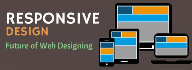
Do You Know What Responsive Website Design Is?
Responsive Web Design is used to construct sites that get re-sized or re-adjusted according to the handheld devices in which it is surfed. You can view contents, videos, sidebars, images and more re-aligned proportionately as per the mobile phone screen size, setting aside horizontal scrolling or being removed utterly. As a result, Responsive Design has now turned out more of a requisite than up-to-the-minute technology since it supports equally mobile as well as desktop users.

What Numbers Yak About Adoption Of Responsive Web Design Technology?
- 47% of people expect a web page to load in two seconds or less
- 4/5 consumers shop on smartphones
- 60% of all website traffic is from mobile devices
- 40% of the mass would choose a different search result if the first is not mobile friendly
Wow! That’s amazing.Now let us flip through the strong rationales behind increasing fandom of Responsive Website Technology.
Vital Reasons Why Responsive web Designs Are Watched As Future of Web Designing
1. Google is Passionate about Responsive Web Design:
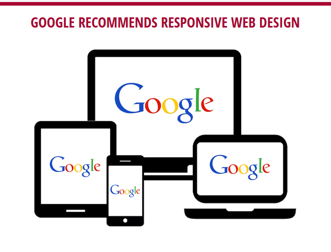
In this internet era, GOOGLE is the user’s favorite choice amongst all the available search engine. It is dependable, accessible and provides rapid and most relevant search results. The recent trends & surveys demonstrate that Google now considers that more than half of the searches are made on smart phones. Due to which, Google not only recommends and promotes the responsive web design sites while publishing its search results but also follows it. Also, all the Google services are now mobile friendly as when searching for local services via mobile, the Google search outcomes show mobile sites at the top.
2. SEO Favorable:
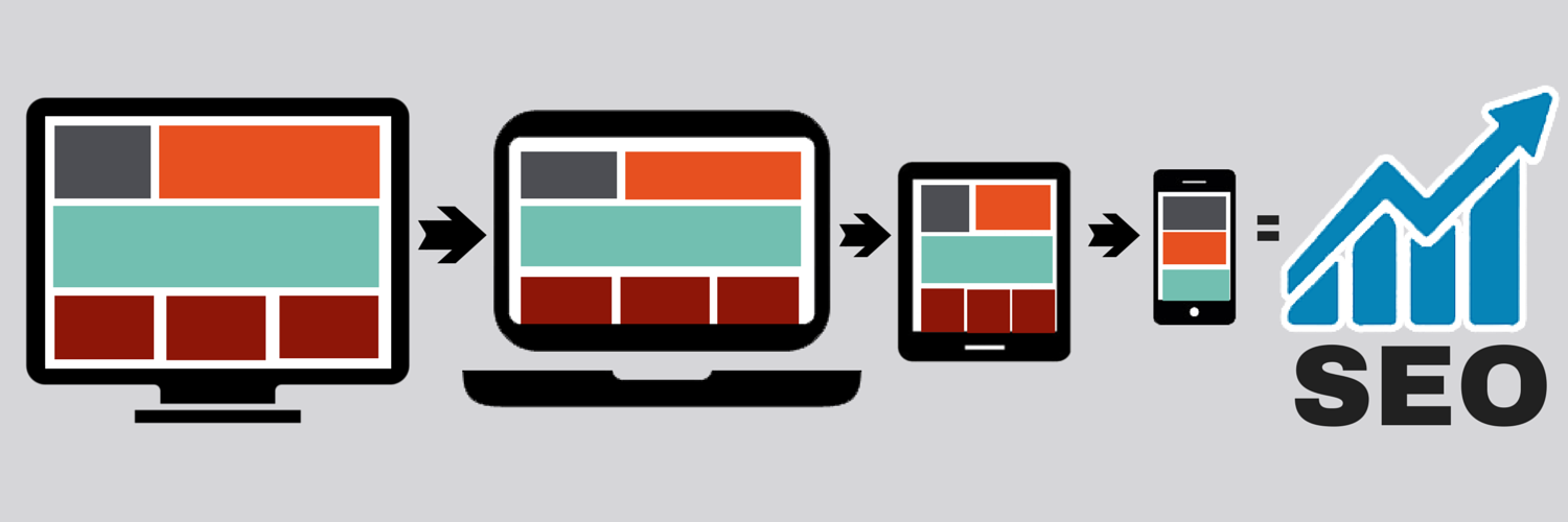
Another intention why Responsive Web Designs are considered SEO friendly in comparison to mobile designs is the concept of one site, one URL. For mobile sites, you have to make a different domain altogether by posting a different website for all devices, but in responsive the portals responds according to the device. So, there is no duplication of content and web pages. And also having one particular URL makes it simple as ABC for Google to crawl and index the site.
3. Amplified Usage of Mobile Internet: With the advent of Smart Phones, the internet usage has moved over from desktops to mobile devices as they are effortless to use and handy in nature. Thus, maximum searches are done through mobile devices and the traffic is now traversing from desktop optimized sites to responsive ones. Make way for more and more etraffic by going responsive with higher conversion rate compare to others.
4. Uninterrupted Cross – Device Experience: As already said, Responsive Web Designs optimize itself, according to the device, which means a website gets displayed in every device & desktops with the same look and feel. Furthermore, because of this cutting-edge feature of the responsive design, the websites will be adaptable to the future devices as well without a shadow of a doubt.
5. Uncomplicated Maintenance: The support and maintenance for responsive websites are not a HERCULEAN task, just because it has one URL, one site. Thence, the merchants/vendors only need to maintain a sole website and domain. The website owners no more have to trouble head about creating multiple websites for diverse devices.
Astute business owners and fore-runners have already without much ado opted for Responsive web development by hiring responsive web designers.If you too are looking for a Responsive Web Designing Company to contrive or migrate your existing website into a responsive web portal, then Techno Infonet can help you. Techno Infonet is a leading Web Design & Web Development service provider based in the USA since 2004. Also, if you want to hire designers from Techno Infonet, you can always get in touch with us.
Time to Go Responsive!!!